Client: Willow Kids Ministry
Role: Branding, Design, and Creative Direction
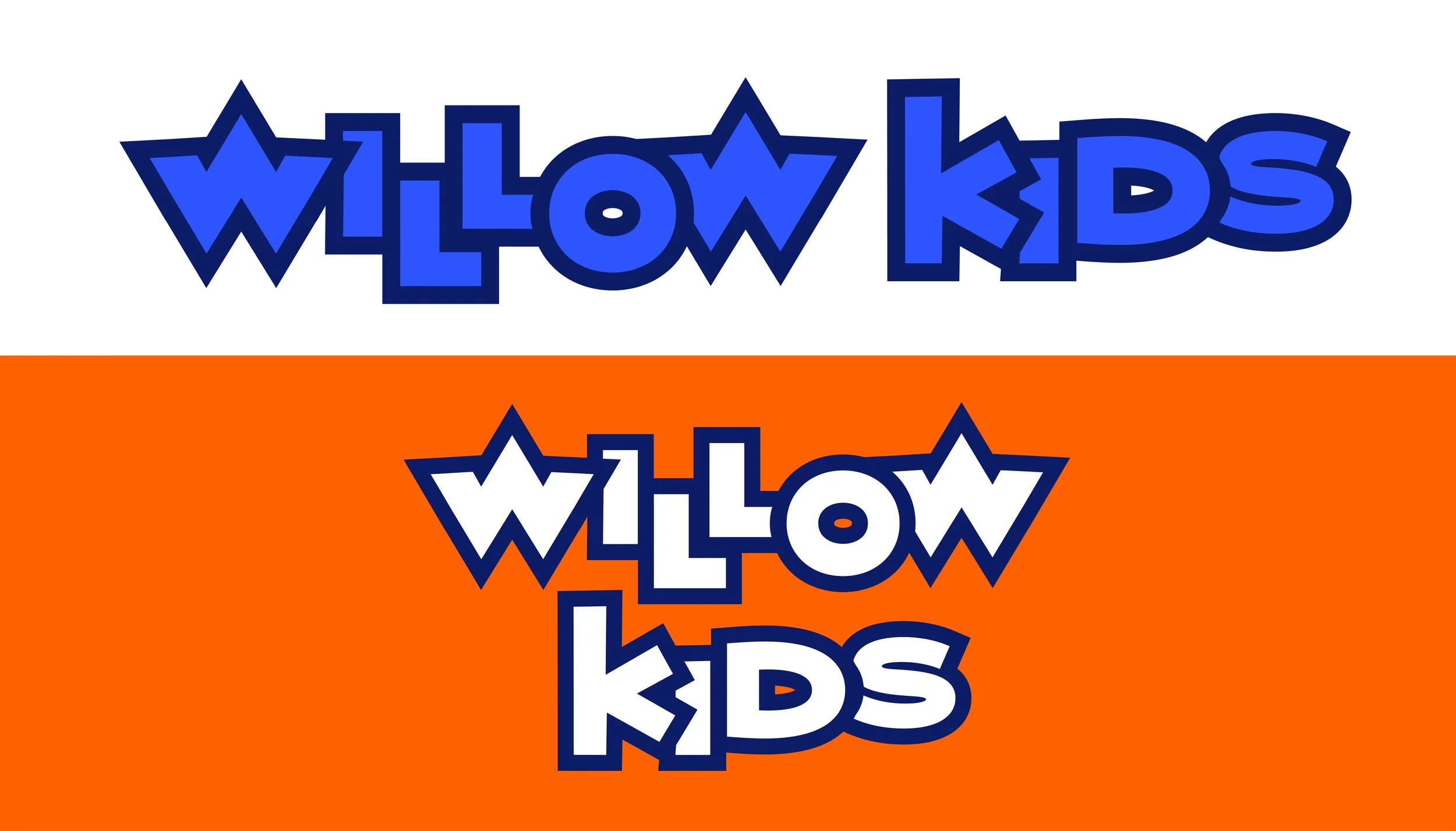
Willow Creek’s children’s ministry underwent a brand change in the fall of 2021. With a new name and redefined values, the group wanted a brand that was fun, relational, authentic, intentional, inclusive, and gospel-centered. The brand has a superhero style that is specifically notable in the logo’s star-inspired “W”. The color palette is particularly instrumental in appealing to the primary demographic of upper-elementary school boys. Blue, green, and orange are emphasized in the brand collateral, but moments of purple and pink add necessary hints of femininity. While the brand is composed of sharp-angled shapes and letters, an “erase-painting” design component adds a nice softness to the brand as a whole.

Tone Board


