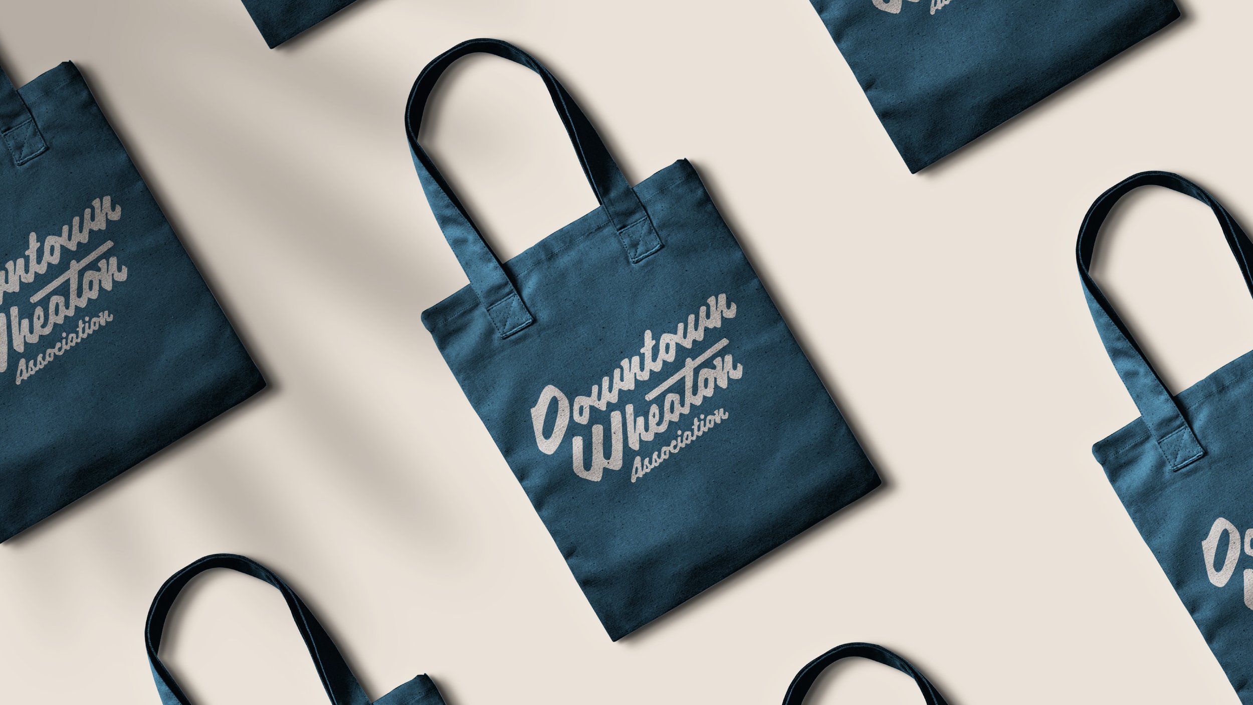
Client: Downtown Wheaton Association
Role: Creative Direction, Design
The Downtown Wheaton Association is a nonprofit that seeks to help small businesses thrive in central Wheaton, IL. Through the creation of events, promotions, and targeted economic development the DWA helps draw guests to explore the town’s storefronts and restaurants.
Through the strategic discovery process I identified that attracting small businesses, making businesses and patrons feel at home, and embracing the organization’s smart yet playful spirit as the primary goals of the rebrand. The DWA is friendly, fun, and community-oriented, and I wanted to ensure the logo embodied those characteristics as well.
The first logo option is called “Welcome Home” and has a friendly, classic Americana vibe. The letters have a charming rounded quality. This logo maintains some brand equity by including a wayfinder, the organization's previous symbol, into the negative space of the capital “D”.
The second logo, “Building a Legacy” takes one of the most recognizable buildings of Downtown Wheaton, the Historic DuPage County Courthouse, and weaves it into the capital “D”. This logo has a charming, homey feel that capitalizes on the great history of Wheaton, and exemplifies being community-oriented.
The third logo, “Right Place, Right Time” also preserves DWA’s brand equity by weaving a wayfinder into the capital “W”. This logo has a lot of movement in the letters, a trait the client enjoyed in the moodboarding phase.
I named the fourth logo “Warm Welcome”. The DWA was interested in the logo including a key landmark from the town in the logo. The fireplace pillar is a gathering spot within the community, and symbolizes the warmth of both the community and DWA alike.
The fifth logo, “No Place Like Home” has a warm, welcoming tone that optimistically slants upward. The ink-like quality of the letterforms balances a polished and on-trend aesthetic with a quaint small-town quality.
