Role: Creative Direction, design
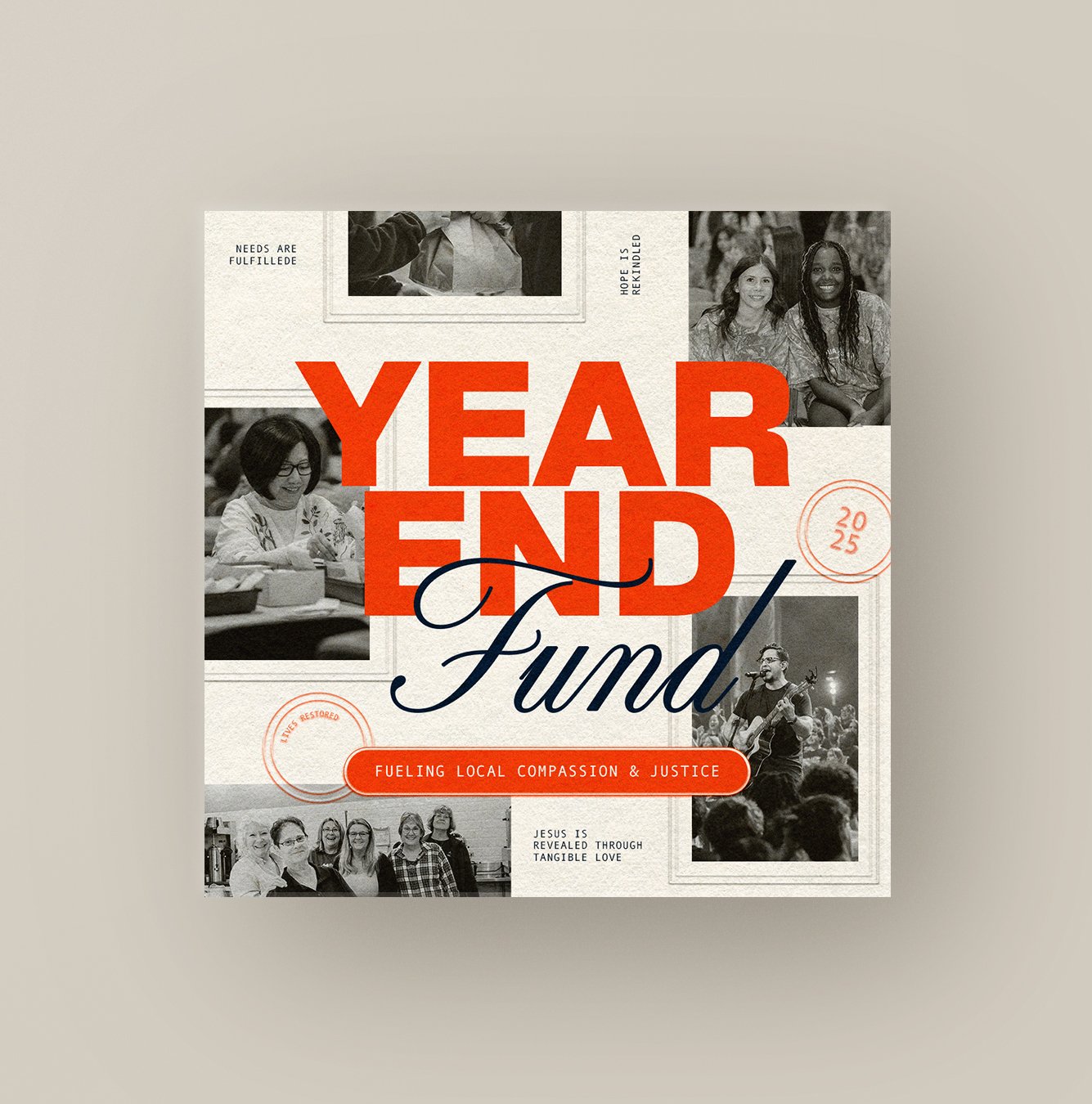
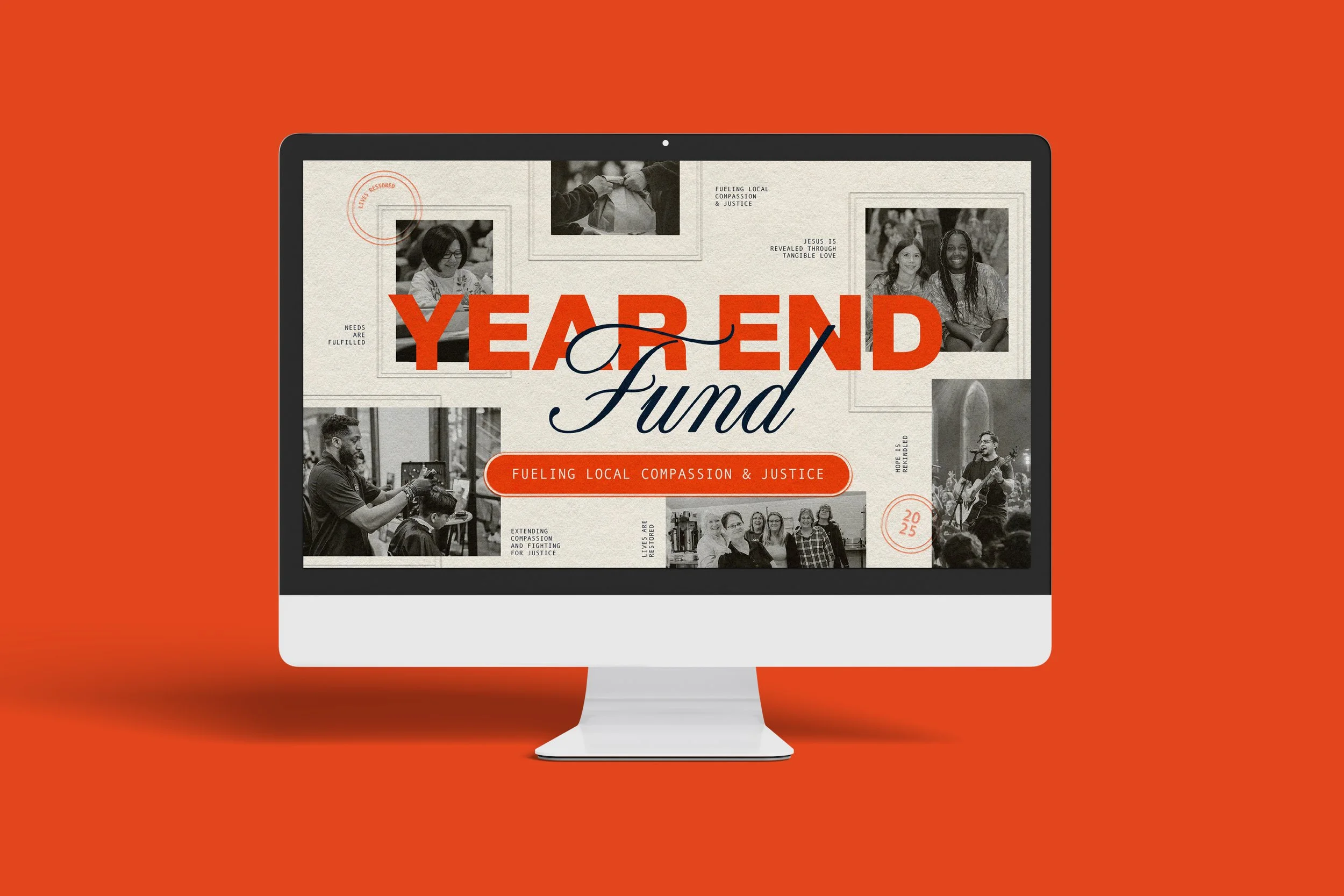
The Year-End Fund design for Willow Creek leans into a warm, vintage aesthetic that feels both familiar and fresh. Sepia-toned photos, layered typography, and textured backgrounds work together to highlight real people and genuine moments of compassion. The framed imagery and subtle stamp details nod to memory and legacy—an intentional way of honoring the stories behind Willow’s impact.
The color palette centers on Willow’s navy and cream, with a bold poppy orange bringing energy and focus to the message. The mix of a sturdy sans serif and a classic script reflects the heart of the campaign: steady generosity paired with the personal, human side of their mission.
Altogether, the design captures the spirit of the Year-End Fund—meeting needs, fueling justice, and restoring hope throughout our local communities.