Client: The Electric Cheetah
Role: Strategy, Creative Direction, Design
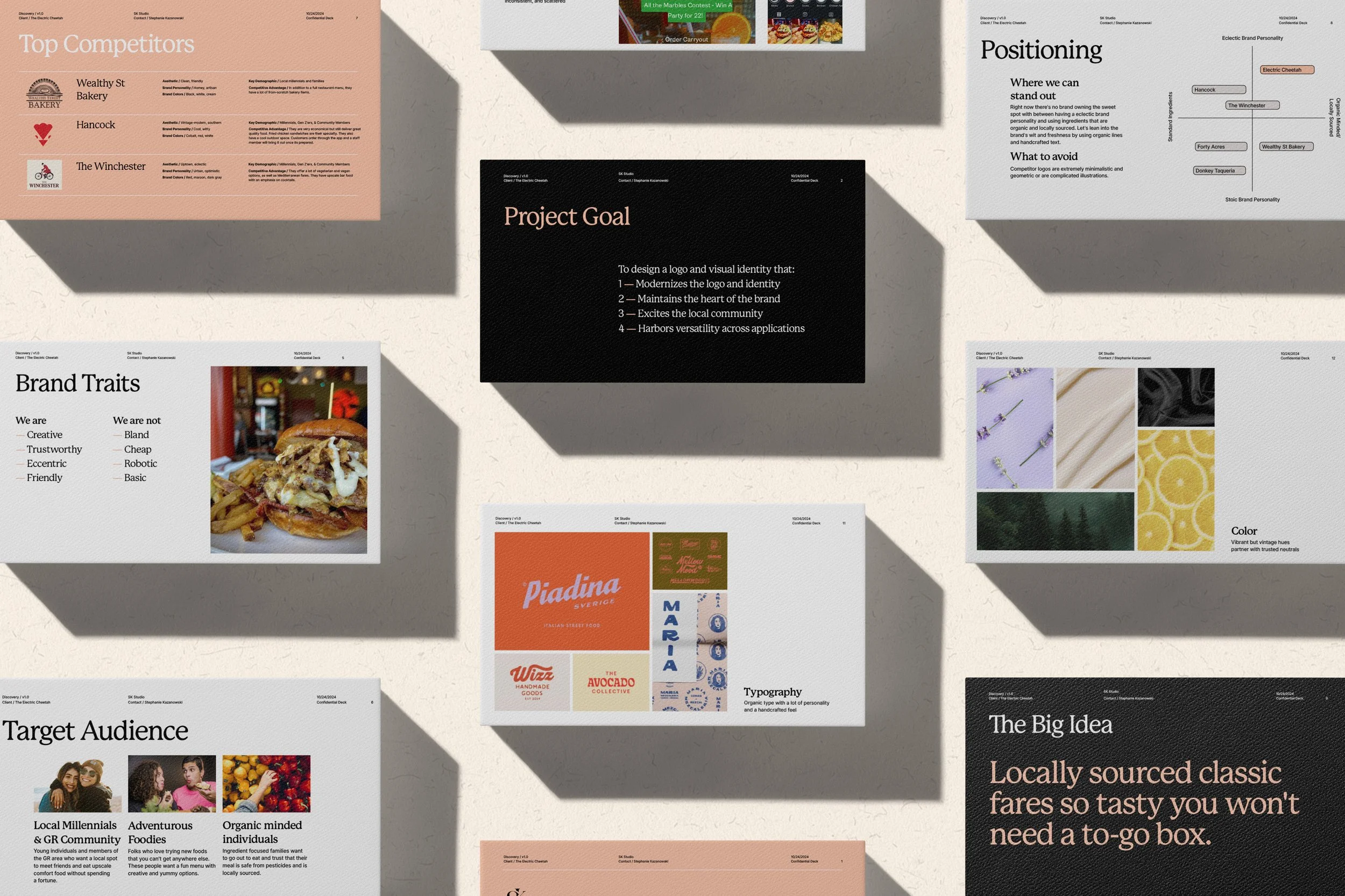
The Electric Cheetah is a charming, eclectic eatery in Grand Rapids, MI. The restaurant’s organic, locally-sourced ingredients fuel their Midwestern spirit and hungry customers alike. Through the strategic discovery process I identified that local community appeal, versatility across applications, modern visuals, and preservation of the brand’s charm as the primary goals of the rebrand.
I created three logo options that embody these ambitions, and take into account factors including the Electric Cheetah’s brand traits, target audience, top competitors, and their unique position within the market.
I named the first logo “Heads or Tails”. The wordmark’s “L” transforms into a lightning bolt and weaves the “H” into a tail. The emblem also incorporates bolts into the cheetah icon’s malar stripe.
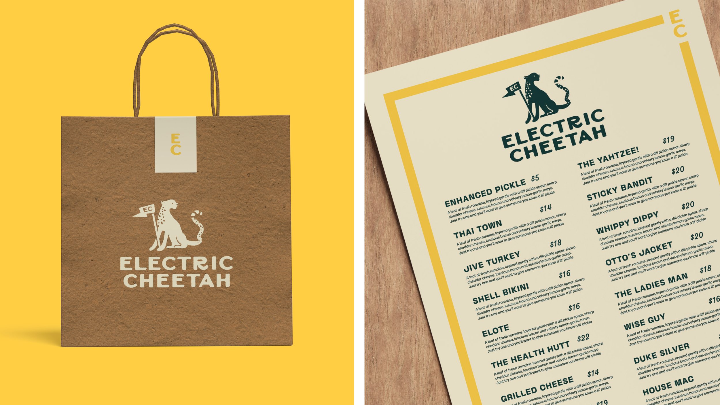
Logo two is dubbed “Cheer for Cheetah!” This illustrative logo has a stamp-like quality. A lightning bolt subtly becomes the shape for the flag, and the letter “R” maintains playfulness in the wordmark by curling into a tail.
The third logo, or “Power Play”, has a lot of energy. The movement of the letterform’s thicks and thins has an electric quality. The extended cross of the “T” becomes a unique bolt.


