Client: Willow Creek Community Church
Role: Creative Direction, Design
Willow Creek’s two-week “Amen and Amen” series was a worship experience designed around the sacraments of baptism and communion. Willow Creek’s brief explained that “When we first place our faith in Jesus, we demonstrate this publicly through the act of baptism, and then we rhythmically come back again and again and again to the life change offered to us through the life, death, and resurrection of Jesus through the discipline of remembrance and receiving communion.”
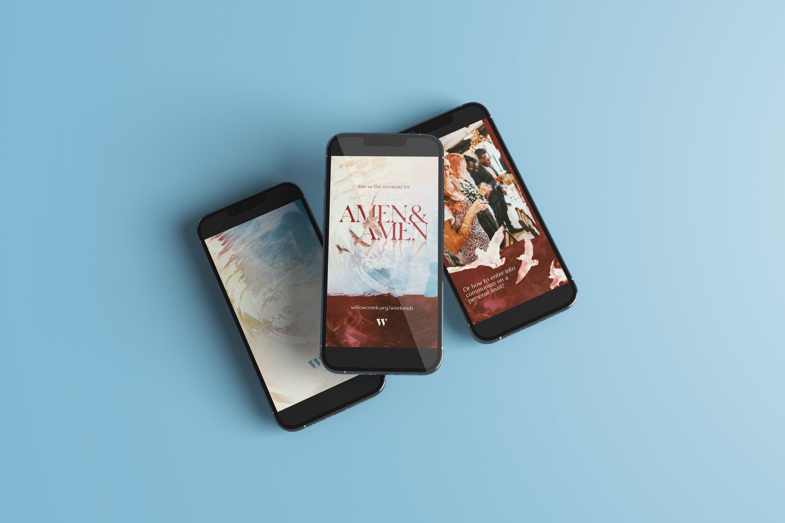
I chose doves, an overtly religious image for the branding, to convey the sacredness of both baptism and communion. The dove is a great symbol and tie to Matthew 3:16-17: "As soon as Jesus was baptized, he went up out of the water. At that moment heaven was opened, and he saw the Spirit of God descending like a dove and alighting on him. And a voice from heaven said, 'This is my Son, whom I love; with him I am well pleased.'"
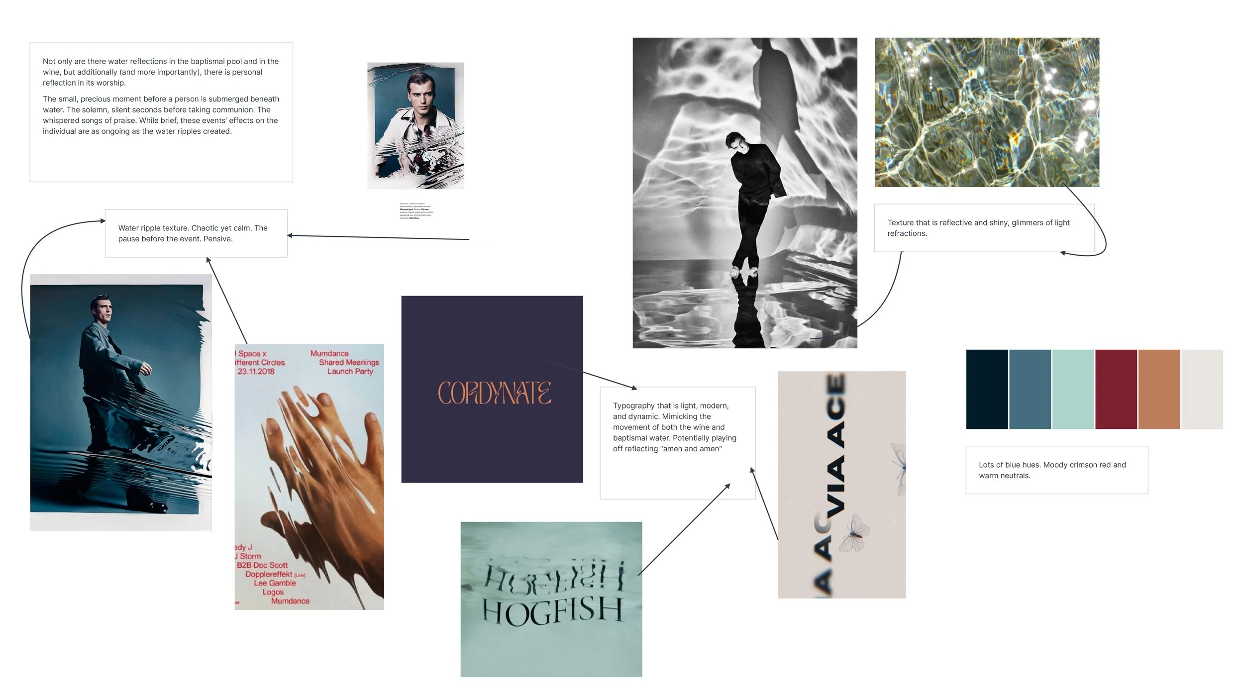
Other notable features of this design include the reflected text and a water ripple effect. The contrast between the water ripples and the smooth texture represents the surreal “pause” in time that happens immediately before baptism and communion. Having the color palette lean heavily into the creamy warm neutrals and stark reds conveys holiness and the eternal magnitude of these moments.


